Customisation
Socket’s widget can be customised in the following ways:
- Support for selected sending and destination chains/tokens
- Pre-selecting default chain/tokens
- CSS styling & color scheme
Adding support for select chains on widget
-
Example Codeimport { Bridge } from "@socket.tech/plugin";
import { Provider } from "./providerComponent";
function SocketBridge() {
// Support for Ethereum, Polygon, Arbitrum & Optimism as sending chains
const sourceNetworks = [1, 137, 42161, 10];
// Support for Arbitrum & Optimism as destination chains
const destinationNetworks = [42161, 10];
return (
<Bridge
provider={Provider}
API_KEY={process.env.SOCKET_API_KEY}
sourceNetworks={sourceNetworks}
destNetworks={destinationNetwork}
/>
);
}
export default SocketBridge;
Pre-selecting default source and destination chains/tokens
-
Example Codeimport { Bridge } from "@socket.tech/plugin";
import { Provider } from "./providerComponent";
function SocketBridge() {
// Pre-selecting default source chain as Ethereum and destination chain as Optimism
const defaultSourceNetwork = 1;
const defaultDestNetwork = 10;
// Pre-selecting default sending token as USDC on Ethereum and destination token as sUSD on Optimism
const defaultSourceToken = "0xA0b86991c6218b36c1d19D4a2e9Eb0cE3606eB48";
const defaultDestToken = "0x8c6f28f2F1A3C87F0f938b96d27520d9751ec8d9";
return (
<Bridge
provider={Provider}
API_KEY={process.env.SOCKET_API_KEY}
defaultSourceNetwork={defaultSourceNetwork}
defaultDestNetwork={defaultDestNetwork}
defaultSourceToken={defaultSourceToken}
defaultDestToken={defaultDestToken}
/>
);
}
export default SocketBridge;
Passing custom token list as URL
-
tokenList prop needs to be passed with URL of token list. The token list must follow this schema.
-
For creating a custom list, the tokens key in the JSON must map to an array of objects, where each object has token details such as
chainId,address,name,symbol,decimals,logoURI -
All Tokens on supported chains must be included in the same array with respective chainId and address
-
In case a custom token list is not passed, then Bungee’s default token list is used
-
Example Codeimport { Bridge } from "@socket.tech/plugin";
import { Provider } from "./providerComponent";
function SocketBridge() {
// Example URL of token list
// Most examples at tokenlist.org
const UNISWAP_TOKEN_LIST =
"https://gateway.ipfs.io/ipns/tokens.uniswap.org";
return (
<Bridge
provider={Provider}
API_KEY={process.env.SOCKET_API_KEY}
tokenList={UNISWAP_TOKEN_LIST}
/>
);
}
export default SocketBridge;
Passing custom token list as Object
-
A token Object must have the following properties
chainId,address,name,symbol,decimals,logoURI -
All Tokens on supported chains must be included in the same array with respective chainId and address
-
Example Codeimport { Bridge } from "@socket.tech/plugin";
import { Provider } from "./providerComponent";
function SocketBridge() {
const customTokenList = [
{
name: "Dai Stablecoin",
address: "0x6B175474E89094C44Da98b954EedeAC495271d0F",
symbol: "DAI",
decimals: 18,
chainId: 1,
logoURI:
"https://raw.githubusercontent.com/trustwallet/assets/master/blockchains/ethereum/assets/0x6B175474E89094C44Da98b954EedeAC495271d0F/logo.png",
},
{
name: "Dai Stablecoin",
address: "0x8f3Cf7ad23Cd3CaDbD9735AFf958023239c6A063",
symbol: "DAI",
decimals: 18,
chainId: 137,
logoURI:
"https://raw.githubusercontent.com/trustwallet/assets/master/blockchains/ethereum/assets/0x6B175474E89094C44Da98b954EedeAC495271d0F/logo.png",
},
];
return (
<Bridge
provider={Provider}
API_KEY={process.env.SOCKET_API_KEY}
tokenList={customTokenList}
/>
);
}
export default SocketBridge;
Customising the CSS styling and color scheme
-
A customize prop needs to be passed with styles specified in the example below.
-
All of the styles in the prop are optional
-
NOTE : All colors need to be passed in RGB format.
-
width needs to be specified in px and borderRadius from 0 - 1.
-
Example Codeimport { Bridge } from "@socket.tech/plugin";
import { Provider } from "./providerComponent";
function SocketBridge() {
type CustomizationProps = {
width: number;
responsiveWidth: boolean;
borderRadius: number;
accent: string;
onAccent: string;
primary: string;
secondary: string;
text: string;
secondaryText: string;
interactive: string;
onInteractive: string;
outline: string;
fontFamily: string;
};
const customize: CustomizationProps = {
width: 380,
responsiveWidth: false,
borderRadius: 0.8,
accent: "rgb(131,249,151)",
onAccent: "rgb(0,0,0)",
primary: "rgb(9,4,31)",
secondary: "rgb(26,27,52)",
text: "rgb(255,255,255)",
secondaryTextColor: "rgb(200,200,200)",
interactive: "rgb(15, 20, 66)",
onInteractive: "rgb(240,240,240)",
outline: "rgb(18,26,91)",
fontFamily: "Courier New",
};
return (
<Bridge
provider={Provider}
singleTxOnly={false} // Shows routes requiring two or more txs from user
API_KEY={process.env.SOCKET_API_KEY}
customize={customize}
/>
);
}
export default SocketBridge;
In-Widget Customisation
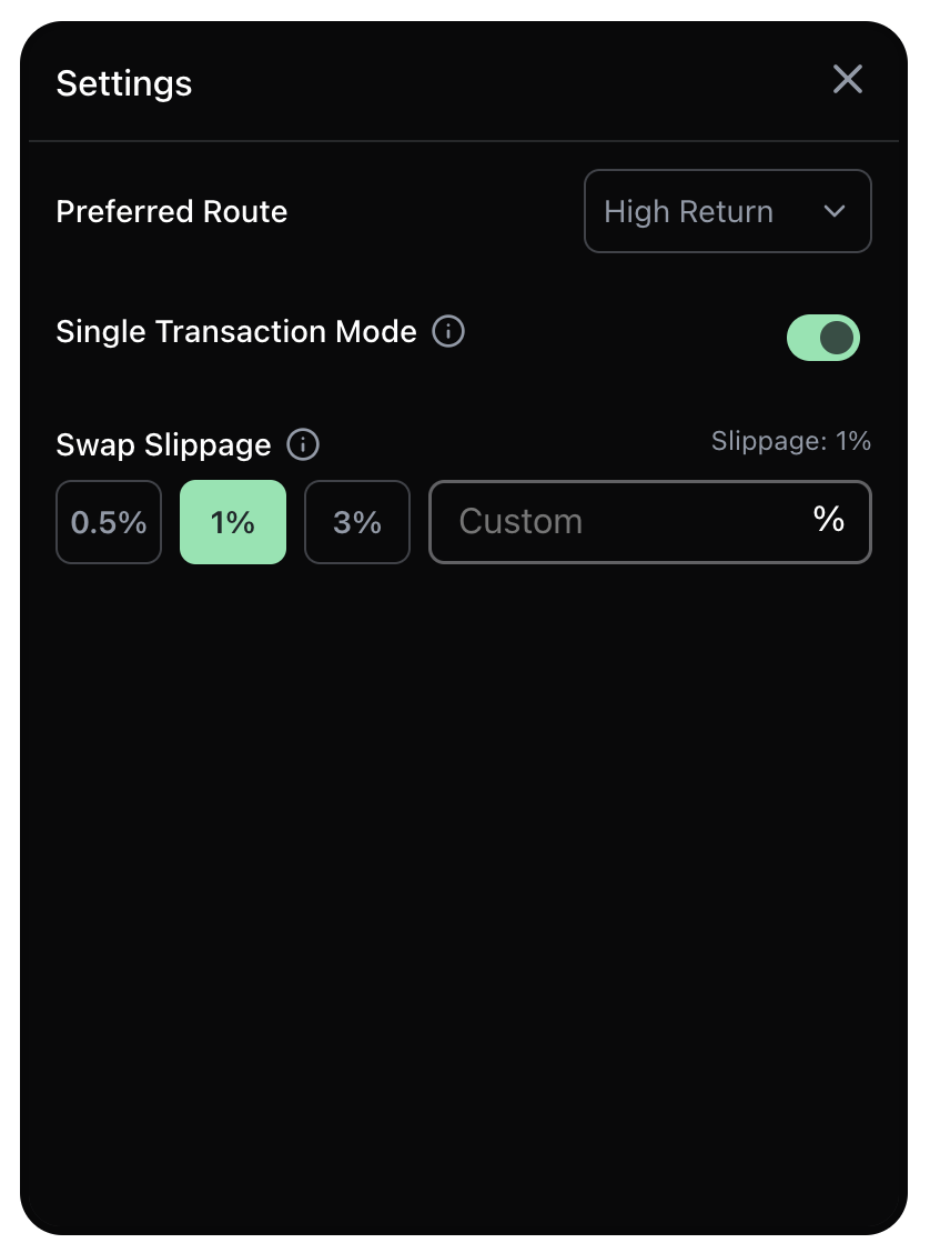
Users can also navigate to PlugIn settings and customise the following parameters
- Preferred Route : Users can choose the route with Highest Return, Fastest Bridging Time or Lowest Fee
- Single Transaction Mode : When turned on, only returns bridge routes that can be completed by a single tx on the source chain. By default this is toggled off.
- Swap Slippage : Allows users to set slippage for any swap transactions involved before/after bridging or for same chain swaps. Default slippage is 1%.
Customised Examples :
Default theme :
Code :
customize: {
  width: 360,
  responsiveWidth: false,
  borderRadius: 1
}
Dark theme :
Code :
customize: {
    width: 360,
    responsiveWidth: false,
    borderRadius: 1,
    secondary: 'rgb(68,69,79)',
    primary: 'rgb(31,34,44)',
    accent: 'rgb(131,249,151)',
    onAccent: 'rgb(0,0,0)',
    interactive: 'rgb(0,0,0)',
    onInteractive: 'rgb(240,240,240)',
    text: 'rgb(255,255,255)',
    secondaryText: 'rgb(200,200,200)',
  }
Dark/Blue theme :
Code :
customize: {
    width: 360,
    responsiveWidth: false,
    borderRadius: 1,
    primary: "rgb(9,4,31)",
    secondary: "rgb(26,27,52)",
    text: "rgb(254,254,254)",
    secondaryText: 'rgb(240,240,240)',
    accent: "rgb(64,199,249)",
    onAccent: 'rgb(255,255,255)',
    interactive: "rgb(15, 20, 66)",
    onInteractive: "rgb(255,255,255)",
  }
Refuel enabled :
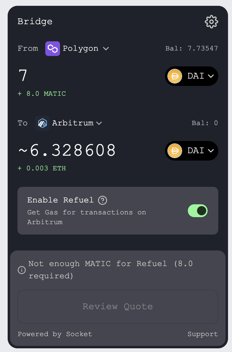
Props Code :
<Bridge
  provider={Provider}
  API_KEY={process.env.SOCKET_API_KEY}
  customize={{
    width: 360,
    responsiveWidth: false,
    borderRadius: 1,
    secondary: "rgb(68,69,79)",
    primary: "rgb(31,34,44)",
    accent: "rgb(131,249,151)",
    onAccent: "rgb(0,0,0)",
    interactive: "rgb(0,0,0)",
    onInteractive: "rgb(240,240,240)",
    text: "rgb(255,255,255)",
    secondaryText: "rgb(200,200,200)",
    fontFamily: "Courier New",
  }}
  enableRefuel={true}
/>